Building defence from first principles
The brief
Identity, website, and UI concept for counter-drone systems startup.
Who
Riku Tuppela
Role
Brand designer, sole designer
Time
2026-Ongoing
Sector
Defence tech • Counter-Drone systems
My vision was clear before we started. Stendr would communicate in a minimal and sophisticated, almost boring way. The kind of brand that doesn't need to perform confidence. Instead, it emanates it.

The process
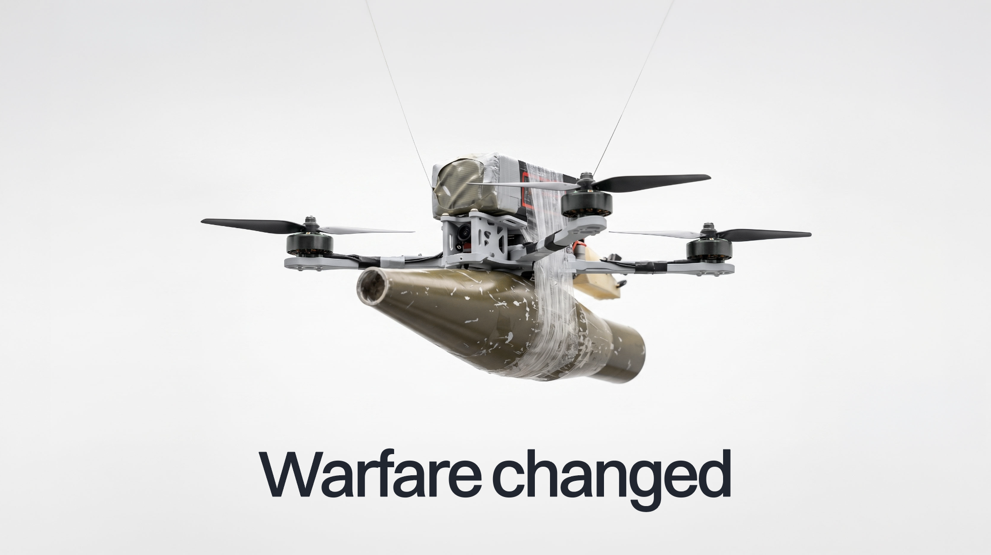
Dark backgrounds, aggressive typography, tactical UI aesthetics borrowed from video games. The category almost seemed like it had decided what defence looks like.
Stendr's positioning came from that observation. Polar white. Surgical clarity. The kind of confidence that doesn't need to announce itself.
I imagined this industry in a diplomatic setting where aggressive brand imagery doesn't necessarily help the cause. If the entire category performs strength, the brand that simply has it will stand apart.
The visual language followed from that decision, not the other way around.
Every defence tech brand I found looked the same.
The logo
Swiss aesthetic triggers high-value associations. Sits comfortably at the intersection of utility, military and precision.


Gnomon
A gnomon is the upright pin of a sundial. From the Greek γνώμων, one who knows.
It does not move. It measures by standing while the sun walks across the sky.
Four of them, identical, rotated, locked around a centre. The same module repeated around the same point.

Veraldarnagli
Old Norse, literally world-nail. The historical name for Polaris.
The shape of the brandmark itself reads as a crosshair, a compass rose, a cross, a star. D-pad even. Variants of one idea. Shapes that all point to a direction or a place in one way or another.
The Norse thought that a nail had been punched through the dome of the sky and the cosmos turned around it.

Logotype
Stendr is the Old Norse verb standa in the third-person singular present tense. It translates as "stands".
The logotype is set in a contemporary Swiss grotesk, because I wanted the brand to communicate precision.
The voice
Stendr doesn't have a tone. Stendr has a personality.
Stendr speaks like a sophisticated senior operator briefing a commander. Not a vendor pitching a client. It doesn't perform confidence. It doesn't need to.
The brand speaks from that place. Calm, precise, and in possession of capabilities that are never announced.
The linguistic formula
When you are writing copy for our website or a deck, keep this formula in mind:
Instead of Destroy
Instead of Lethal
Instead of Weapons / Attacks
Negate, Resolve, Conclude.
Definitive, Absolute, Final.
Capabilities, Outcomes, Leverage.
Dos and don'ts
Keep in mind that Stendr speaks confidently with poise. It doesn’t use capitals in midsentence.
Building Defense from First Principles
Building defense from first principles
The colors
Stendr is light mode first. White dominates.
The palette moves from Arctic White through five grades of grey to Stendr Black, a near-black that leans cold, towards blue.
Signal Red appears once. When it does, something important is happening.

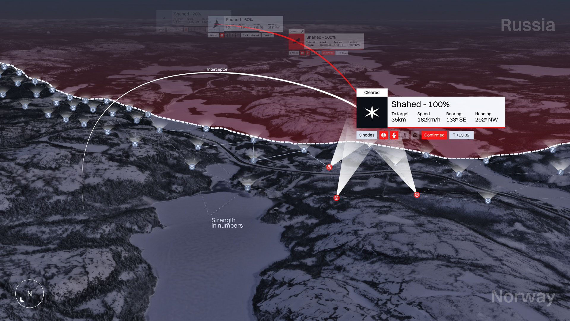
Area control UI concept
Shahed-class targets inbound. Three nodes tracking. One interceptor cleared.
This is not a shipped product. It is a design direction: What the operator experience could look like when the system works as intended.
A sensor network covering the Norway–Russia border.
The result
A brand built from nothing in ten weeks. Visual identity, motion, website, and investor-facing materials, ready before Stendr's first funding round closed.
The work continues. So does the company.